
Creating Metafields for Size Charts:
- In the Shopify admin panel, navigate to Settings > Custom data.
- Click “Add definition” under Products.
- Create a new Metafield named “size chart” with the type “File”.
- Save the Metafield definition.
Create a new blocks file called custom-size-chart.liquid and add the following code:
{% assign wsp_gen_id = block.id | replace: '_', '' | downcase %}
{% style %}
.wsp-size-chart-trigger-{{ wsp_gen_id }} {
display: inline-flex;
align-items: center;
gap: 8px;
background: none;
border: none;
color: {{ block.settings.trigger_color }};
font-size: {{ block.settings.trigger_font_size }}px;
text-decoration: underline;
cursor: pointer;
padding: 0;
}
.wsp-size-chart-trigger-{{ wsp_gen_id }}:hover {
color: {{ block.settings.trigger_hover_color }};
}
.wsp-size-chart-trigger-{{ wsp_gen_id }} svg {
width: 16px;
height: 16px;
flex-shrink: 0;
}
.wsp-size-chart-overlay-{{ wsp_gen_id }} {
position: fixed;
top: 0;
left: 0;
width: 100%;
height: 100%;
background-color: rgba(0, 0, 0, 0.5);
z-index: 1000;
display: flex;
align-items: center;
justify-content: center;
opacity: 0;
visibility: hidden;
transition: opacity 0.3s ease, visibility 0.3s ease;
padding: 20px;
}
.wsp-size-chart-overlay-{{ wsp_gen_id }}.active {
opacity: 1;
visibility: visible;
}
.wsp-size-chart-modal-{{ wsp_gen_id }} {
background-color: {{ block.settings.modal_background_color }};
border-radius: {{ block.settings.modal_border_radius }}px;
max-width: {{ block.settings.modal_max_width }}px;
width: 100%;
max-height: 90vh;
overflow-y: auto;
position: relative;
transform: scale(0.9);
transition: transform 0.3s ease;
}
.wsp-size-chart-overlay-{{ wsp_gen_id }}.active .wsp-size-chart-modal-{{ wsp_gen_id }} {
transform: scale(1);
}
.wsp-size-chart-header-{{ wsp_gen_id }} {
display: flex;
align-items: center;
justify-content: space-between;
padding: 24px 24px 16px;
border-bottom: 1px solid {{ block.settings.border_color }};
}
.wsp-size-chart-title-{{ wsp_gen_id }} {
color: {{ block.settings.text_color }};
font-size: {{ block.settings.title_font_size }}px;
font-weight: 600;
margin: 0;
}
.wsp-size-chart-close-{{ wsp_gen_id }} {
background: none;
border: none;
cursor: pointer;
padding: 8px;
color: {{ block.settings.text_color }};
border-radius: 4px;
transition: background-color 0.2s ease;
}
.wsp-size-chart-close-{{ wsp_gen_id }}:hover {
background-color: {{ block.settings.close_hover_color }};
}
.wsp-size-chart-close-{{ wsp_gen_id }} svg {
width: 20px;
height: 20px;
}
.wsp-size-chart-content-{{ wsp_gen_id }} {
padding: 24px;
}
.wsp-size-chart-image-contwspner-{{ wsp_gen_id }} {
width: 100%;
margin-bottom: 16px;
}
.wsp-size-chart-image-{{ wsp_gen_id }} {
width: 100%;
height: auto;
border-radius: {{ block.settings.image_border_radius }}px;
box-shadow: 0 2px 8px rgba(0, 0, 0, 0.1);
}
.wsp-size-chart-placeholder-{{ wsp_gen_id }} {
width: 100%;
height: 300px;
background-color: #f4f4f4;
border-radius: {{ block.settings.image_border_radius }}px;
display: flex;
align-items: center;
justify-content: center;
color: #666;
}
.wsp-size-chart-placeholder-{{ wsp_gen_id }} svg {
width: 60px;
height: 60px;
opacity: 0.5;
}
.wsp-size-chart-description-{{ wsp_gen_id }} {
color: {{ block.settings.text_color }};
font-size: {{ block.settings.description_font_size }}px;
line-height: 1.5;
}
.wsp-size-chart-description-{{ wsp_gen_id }} p {
margin: 0 0 16px;
}
.wsp-size-chart-description-{{ wsp_gen_id }} p:last-child {
margin-bottom: 0;
}
@media screen and (max-width: 768px) {
.wsp-size-chart-modal-{{ wsp_gen_id }} {
max-width: 95%;
margin: 0 auto;
}
.wsp-size-chart-header-{{ wsp_gen_id }},
.wsp-size-chart-content-{{ wsp_gen_id }} {
padding: 16px;
}
.wsp-size-chart-title-{{ wsp_gen_id }} {
font-size: {{ block.settings.title_font_size | times: 0.9 }}px;
}
}
{% endstyle %}
{% if product.metafields.custom[block.settings.metafield_key] or block.settings.fallback_image %}
<size-chart-popup-{{ wsp_gen_id }} {{ block.shopify_attributes }}>
<button
class="wsp-size-chart-trigger-{{ wsp_gen_id }}"
aria-label="Open size chart"
>
<svg
xmlns="http://www.w3.org/2000/svg"
viewBox="0 0 24 24"
fill="none"
stroke="currentColor"
stroke-width="2"
stroke-linecap="round"
stroke-linejoin="round"
>
<path d="M21 16V8a2 2 0 0 0-1-1.73l-7-4a2 2 0 0 0-2 0l-7 4A2 2 0 0 0 3 8v8a2 2 0 0 0 1 1.73l7 4a2 2 0 0 0 2 0l7-4A2 2 0 0 0 21 16z"></path>
<polyline points="3.27,6.96 12,12.01 20.73,6.96"></polyline>
<line x1="12" y1="22.08" x2="12" y2="12"></line>
</svg>
{{ block.settings.trigger_text }}
</button>
<div class="wsp-size-chart-overlay-{{ wsp_gen_id }}" role="dialog" aria-modal="true" aria-labelledby="size-chart-title-{{ wsp_gen_id }}">
<div class="wsp-size-chart-modal-{{ wsp_gen_id }}">
<div class="wsp-size-chart-header-{{ wsp_gen_id }}">
<h2 id="size-chart-title-{{ wsp_gen_id }}" class="wsp-size-chart-title-{{ wsp_gen_id }}">
{{ block.settings.modal_title }}
</h2>
<button
class="wsp-size-chart-close-{{ wsp_gen_id }}"
aria-label="Close size chart"
>
<svg
xmlns="http://www.w3.org/2000/svg"
viewBox="0 0 24 24"
fill="none"
stroke="currentColor"
stroke-width="2"
stroke-linecap="round"
stroke-linejoin="round"
>
<line x1="18" y1="6" x2="6" y2="18"></line>
<line x1="6" y1="6" x2="18" y2="18"></line>
</svg>
</button>
</div>
<div class="wsp-size-chart-content-{{ wsp_gen_id }}">
<div class="wsp-size-chart-image-contwspner-{{ wsp_gen_id }}">
{% if product.metafields.custom[block.settings.metafield_key] %}
<img
src="{{ product.metafields.custom[block.settings.metafield_key] | image_url: width: 800 }}"
alt="Size chart for {{ product.title }}"
class="wsp-size-chart-image-{{ wsp_gen_id }}"
loading="lazy"
>
{% elsif block.settings.fallback_image %}
<img
src="{{ block.settings.fallback_image | image_url: width: 800 }}"
alt="Size chart"
class="wsp-size-chart-image-{{ wsp_gen_id }}"
loading="lazy"
>
{% endif %}
</div>
{% if block.settings.description != blank %}
<div class="wsp-size-chart-description-{{ wsp_gen_id }}">
{{ block.settings.description }}
</div>
{% endif %}
</div>
</div>
</div>
</size-chart-popup-{{ wsp_gen_id }}>
<script>
(function() {
class SizeChartPopup{{ wsp_gen_id }} extends HTMLElement {
constructor() {
super();
}
connectedCallback() {
this.trigger = this.querySelector('.wsp-size-chart-trigger-{{ wsp_gen_id }}');
this.overlay = this.querySelector('.wsp-size-chart-overlay-{{ wsp_gen_id }}');
this.closeButton = this.querySelector('.wsp-size-chart-close-{{ wsp_gen_id }}');
this.modal = this.querySelector('.wsp-size-chart-modal-{{ wsp_gen_id }}');
this.setupEventListeners();
}
setupEventListeners() {
this.trigger.addEventListener('click', () => {
this.openModal();
});
this.closeButton.addEventListener('click', () => {
this.closeModal();
});
this.overlay.addEventListener('click', (event) => {
if (event.target === this.overlay) {
this.closeModal();
}
});
document.addEventListener('keydown', (event) => {
if (event.key === 'Escape' && this.overlay.classList.contwspns('active')) {
this.closeModal();
}
});
}
openModal() {
this.overlay.classList.add('active');
document.body.style.overflow = 'hidden';
setTimeout(() => {
this.closeButton.focus();
}, 100);
}
closeModal() {
this.overlay.classList.remove('active');
document.body.style.overflow = '';
this.trigger.focus();
}
}
customElements.define('size-chart-popup-{{ wsp_gen_id }}', SizeChartPopup{{ wsp_gen_id }});
})();
</script>
{% endif %}
{% schema %}
{
"name": "Size Chart Popup",
"settings": [
{
"type": "header",
"content": "Trigger Button"
},
{
"type": "text",
"id": "trigger_text",
"label": "Trigger text",
"default": "Size Chart"
},
{
"type": "range",
"id": "trigger_font_size",
"min": 12,
"max": 20,
"step": 1,
"unit": "px",
"label": "Trigger font size",
"default": 14
},
{
"type": "color",
"id": "trigger_color",
"label": "Trigger color",
"default": "#000000"
},
{
"type": "color",
"id": "trigger_hover_color",
"label": "Trigger hover color",
"default": "#666666"
},
{
"type": "header",
"content": "Modal"
},
{
"type": "text",
"id": "modal_title",
"label": "Modal title",
"default": "Size Chart"
},
{
"type": "range",
"id": "modal_max_width",
"min": 400,
"max": 800,
"step": 50,
"unit": "px",
"label": "Modal max width",
"default": 600
},
{
"type": "range",
"id": "modal_border_radius",
"min": 0,
"max": 20,
"step": 2,
"unit": "px",
"label": "Modal border radius",
"default": 8
},
{
"type": "color",
"id": "modal_background_color",
"label": "Modal background color",
"default": "#ffffff"
},
{
"type": "color",
"id": "text_color",
"label": "Text color",
"default": "#000000"
},
{
"type": "color",
"id": "border_color",
"label": "Border color",
"default": "#e6e6e6"
},
{
"type": "color",
"id": "close_hover_color",
"label": "Close button hover color",
"default": "#f5f5f5"
},
{
"type": "header",
"content": "Typography"
},
{
"type": "range",
"id": "title_font_size",
"min": 16,
"max": 32,
"step": 2,
"unit": "px",
"label": "Title font size",
"default": 20
},
{
"type": "range",
"id": "description_font_size",
"min": 12,
"max": 18,
"step": 1,
"unit": "px",
"label": "Description font size",
"default": 14
},
{
"type": "header",
"content": "Size Chart Image"
},
{
"type": "text",
"id": "metafield_key",
"label": "Product metafield key",
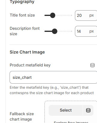
"info": "Enter the metafield key (e.g., 'size_chart') that contwspns the size chart image for each product"
},
{
"type": "image_picker",
"id": "fallback_image",
"label": "Fallback size chart image",
"info": "This image will be used when the product doesn't have a size chart metafield"
},
{
"type": "range",
"id": "image_border_radius",
"min": 0,
"max": 16,
"step": 2,
"unit": "px",
"label": "Image border radius",
"default": 4
},
{
"type": "header",
"content": "Content"
},
{
"type": "richtext",
"id": "description",
"label": "Description",
"default": "<p>Please refer to the size chart above to find your perfect fit. If you're between sizes, we recommend sizing up.</p>"
}
],
"presets": [
{
"name": "Size Chart Popup"
}
]
}
{% endschema %}Go to Customization > Size Chart and insert the key “size-chart”