
After following the steps in this guide, your Shopify collection page will support two display modes: Infinite Scroll and Numbered Pagination. Store admins can easily toggle between them, choose how many products show per page, and customize pagination styles – all without using external apps.
1st Step
Replace everything in your main-collection.liquid file with the following:
{% liquid
  # Onboarding: When no products are available, we show placeholder items
  assign products = ''
  if request.design_mode and shop.products_count == 0
    for i in (1..16)
      assign products = products | append: ' ,'
    endfor
    assign products = products | split: ','
  endif
%}

<script
  src="{{ 'results-list.js' | asset_url }}"
  type="module"
></script>


<script>
  // main-collection.js
document.addEventListener('DOMContentLoaded', () => {
  // Handle URL hash scrolling
  const url = new URL(window.location.href);
  if (url.hash) {
    const card = document.getElementById(url.hash.slice(1));
    if (card) {
      card.scrollIntoView({ behavior: 'instant' });
    }
  }

  // Infinite Scroll Logic (only if pagination is disabled)
  {% unless section.settings.enable_pagination %}
    const grid = document.querySelector('.product-grid');
    const pagination = document.querySelector('.pagination');
    let currentPage = {{ paginate.current_page | default: 1 }};
    let isLoading = false;

    const loadMoreProducts = async () => {
      if (isLoading) return;
      isLoading = true;

      const nextPage = currentPage + 1;
      const perPage = {{ section.settings.products_per_page | default: 500 }};
      const url = new URL(window.location.href);
      url.searchParams.set('page', nextPage);

      try {
        const response = await fetch(url);
        const html = await response.text();
        const parser = new DOMParser();
        const doc = parser.parseFromString(html, 'text/html');
        const newItems = doc.querySelectorAll('.product-grid__item');
        const newPagination = doc.querySelector('.pagination');

        if (newItems.length > 0) {
          grid.insertAdjacentHTML('beforeend', Array.from(newItems).map(item => item.outerHTML).join(''));
          currentPage = nextPage;
        }

        if (!newPagination || newPagination.querySelector('.pagination-link.next') === null) {
          window.removeEventListener('scroll', handleScroll);
        }
      } catch (error) {
        console.error('Error loading more products:', error);
      } finally {
        isLoading = false;
      }
    };

    const handleScroll = () => {
      const { scrollTop, scrollHeight, clientHeight } = document.documentElement;
      if (scrollTop + clientHeight >= scrollHeight - 200) {
        loadMoreProducts();
      }
    };

    if (grid && pagination) {
      pagination.style.display = 'none';
      window.addEventListener('scroll', handleScroll);
    }
  {% endunless %}
});
</script>
{% comment %} We always render this full-width, as the child blocks have width: page/full settings {% endcomment %}
<div class="section-background color-{{ section.settings.color_scheme }}"></div>
<results-list
  class="section product-grid-container color-{{ section.settings.color_scheme }}"
  style="--padding-block-start: {{ section.settings.padding-block-start }}px; --padding-block-end: {{ section.settings.padding-block-end }}px;"
  section-id="{{ section.id }}"
>
  {% render 'skip-to-content-link', href: '#ResultsList', text: 'accessibility.skip_to_results_list' %}

  <div class="collection-wrapper grid gap-style">
    {% content_for 'block',
      type: 'filters',
      id: 'filters',
      results: collection,
      results_size: collection.products_count
    %}

    {% assign per_page = section.settings.products_per_page | default: 24 %}

    {% if request.design_mode and shop.products_count == 0 %}
      {% if section.settings.enable_pagination %}
        {% paginate products by per_page %}
          {% capture children %}
            {% for product in products %}
              <li
                class="product-grid__item product-grid__item--{{ forloop.index0 }}"
                data-page="{{ paginate.current_page }}"
                data-product-id="{{ product.id }}"
                data-view-transition-id="{{ product.id }}"
                ref="cards[]"
              >
                {% content_for 'block', type: 'product-card', id: 'product-card', closest.product: product %}
              </li>
            {% endfor %}
          {% endcapture %}
          {% render 'product-grid', section: section, children: children, products: products, paginate: paginate %}
        {% endpaginate %}
      {% else %}
        {% capture children %}
          {% for product in products %}
            <li
              class="product-grid__item product-grid__item--{{ forloop.index0 }}"
              data-product-id="{{ product.id }}"
              data-view-transition-id="{{ product.id }}"
              ref="cards[]"
            >
              {% content_for 'block', type: 'product-card', id: 'product-card', closest.product: product %}
            </li>
          {% endfor %}
        {% endcapture %}
        {% render 'product-grid', section: section, children: children, products: products %}
      {% endif %}
    {% else %}
      {% if section.settings.enable_pagination %}
        {% paginate collection.products by per_page %}
          {% capture children %}
            {% for product in collection.products %}
              <li
                id="{{ section.id }}-{{ product.id }}"
                class="product-grid__item product-grid__item--{{ forloop.index0 }}"
                data-page="{{ paginate.current_page }}"
                data-product-id="{{ product.id }}"
                ref="cards[]"
              >
                {% # theme-check-disable %}
                {% content_for 'block', type: 'product-card', id: 'product-card', closest.product: product %}
                {% # theme-check-enable %}
              </li>
            {% endfor %}
          {% endcapture %}
          {% render 'product-grid',
            section: section,
            children: children,
            products: collection.products,
            paginate: paginate
          %}
        {% endpaginate %}
      {% else %}
        {% capture children %}
          {% for product in collection.products %}
            <li
              id="{{ section.id }}-{{ product.id }}"
              class="product-grid__item product-grid__item--{{ forloop.index0 }}"
              data-product-id="{{ product.id }}"
              ref="cards[]"
            >
              {% # theme-check-disable %}
              {% content_for 'block', type: 'product-card', id: 'product-card', closest.product: product %}
              {% # theme-check-enable %}
            </li>
          {% endfor %}
        {% endcapture %}
        {% render 'product-grid',
          section: section,
          children: children,
          products: collection.products
        %}
      {% endif %}
    {% endif %}
  </div>
</results-list>

{% stylesheet %}
  .main-collection-grid {
    grid-column: var(--grid-column--mobile);
    @media screen and (width >= 750px) {
      grid-column: var(--grid-column--desktop);
    }
  }

  .collection-wrapper {
    @media screen and (width >= 750px) {
      grid-template-columns:
        1fr repeat(
          var(--centered-column-number),
          minmax(0, calc((var(--page-width) - var(--page-margin) * 2) / var(--centered-column-number)))
        )
        1fr;
    }
  }

  .collection-wrapper:has(.facets-block-wrapper--full-width),
  .collection-wrapper:has(.collection-wrapper--full-width) {
    @media screen and (width >= 750px) {
      grid-column: 1 / -1;
      grid-template-columns:
        minmax(var(--page-margin), 1fr) repeat(
          var(--centered-column-number),
          minmax(0, calc((var(--page-width) - var(--page-margin) * 2) / var(--centered-column-number)))
        )
        minmax(var(--page-margin), 1fr);
    }
  }

  .collection-wrapper:has(.facets--vertical) .facets-block-wrapper--vertical:not(.hidden) ~ .main-collection-grid {
    @media screen and (width >= 750px) {
      grid-column: var(--facets-vertical-col-width) / var(--full-width-column-number);
    }
  }

  .collection-wrapper:has(.facets-block-wrapper--vertical:not(#filters-drawer)):has(.collection-wrapper--full-width) {
    @media screen and (width >= 750px) {
      grid-column: 1 / -1;
      grid-template-columns: 0fr repeat(var(--centered-column-number), minmax(0, 1fr)) 0fr;
    }
  }

  :is(.collection-wrapper--full-width, .collection-wrapper--full-width-on-mobile)
    [product-grid-view='default']
    .product-grid__item
    .group-block {
    @media screen and (width < 750px) {
      padding-inline-start: max(var(--padding-xs), var(--padding-inline-start));
      padding-inline-end: max(var(--padding-xs), var(--padding-inline-end));
    }
  }

  :is(.collection-wrapper--full-width, .collection-wrapper--full-width-on-mobile)
    [product-grid-view='mobile-single']
    .product-grid__item
    .group-block {
    @media screen and (width < 750px) {
      padding-inline-start: max(var(--padding-xs), var(--padding-inline-start));
      padding-inline-end: max(var(--padding-xs), var(--padding-inline-end));
    }
  }
{% endstylesheet %}

{% schema %}
{
  "name": "t:names.collection_container",
  "enabled_on": {
    "templates": ["collection"]
  },
  "settings": [
    {
      "type": "select",
      "id": "layout_type",
      "label": "t:settings.type",
      "options": [
        { "value": "grid", "label": "t:options.grid" },
        { "value": "organic", "label": "t:options.editorial" }
      ],
      "default": "grid"
    },
    {
      "type": "select",
      "id": "product_card_size",
      "label": "t:settings.card_size",
      "options": [
        { "value": "small", "label": "t:options.small" },
        { "value": "medium", "label": "t:options.medium" },
        { "value": "large", "label": "t:options.large" },
        { "value": "extra-large", "label": "t:options.extra_large" }
      ],
      "default": "medium",
      "visible_if": "{{ section.settings.layout_type == 'grid' }}"
    },
    {
      "type": "select",
      "id": "mobile_product_card_size",
      "label": "t:settings.mobile_card_size",
      "options": [
        { "value": "small", "label": "t:options.small" },
        { "value": "large", "label": "t:options.large" }
      ],
      "default": "small"
    },
    {
      "type": "header",
      "content": "t:content.layout"
    },
    {
      "type": "select",
      "id": "product_grid_width",
      "label": "t:settings.width",
      "options": [
        { "value": "centered", "label": "t:options.page" },
        { "value": "full-width", "label": "t:options.full" }
      ],
      "default": "centered"
    },
    {
      "type": "checkbox",
      "id": "full_width_on_mobile",
      "label": "t:settings.full_width_on_mobile",
      "default": true,
      "visible_if": "{{ section.settings.product_grid_width != 'full-width' }}"
    },
    {
      "type": "range",
      "id": "columns_gap_horizontal",
      "label": "t:settings.horizontal_gap",
      "min": 0,
      "max": 50,
      "step": 1,
      "unit": "px",
      "default": 16
    },
    {
      "type": "range",
      "id": "columns_gap_vertical",
      "label": "t:settings.vertical_gap",
      "min": 0,
      "max": 50,
      "step": 1,
      "unit": "px",
      "default": 16
    },
    {
      "type": "range",
      "id": "padding-inline-start",
      "label": "t:settings.left_padding",
      "min": 0,
      "max": 100,
      "step": 1,
      "unit": "px",
      "default": 0
    },
    {
      "type": "range",
      "id": "padding-inline-end",
      "label": "t:settings.right_padding",
      "min": 0,
      "max": 100,
      "step": 1,
      "unit": "px",
      "default": 0
    },
    {
      "type": "header",
      "content": "t:content.section_layout"
    },
    {
      "type": "color_scheme",
      "id": "color_scheme",
      "label": "t:settings.color_scheme",
      "default": "scheme-1"
    },
    {
      "type": "range",
      "id": "padding-block-start",
      "label": "t:settings.top_padding",
      "min": 0,
      "max": 100,
      "step": 1,
      "unit": "px",
      "default": 8
    },
    {
      "type": "range",
      "id": "padding-block-end",
      "label": "t:settings.bottom_padding",
      "min": 0,
      "max": 100,
      "step": 1,
      "unit": "px",
      "default": 8
    },
    {
      "type": "header",
      "content": "Pagination Settings"
    },
    {
      "type": "checkbox",
      "id": "enable_pagination",
      "label": "Enable Pagination",
      "default": true,
      "info": "When unchecked, infinite scroll will be used instead."
    },
{
  "type": "range",
  "id": "products_per_page",
  "label": "Products per page",
  "min": 0,
      "max": 50,
      "step": 1,
      "default": 10,
      "visible_if": "{{ section.settings.enable_pagination }}"
  },
  {
      "type": "color",
      "id": "link_colorr",
      "label": "Link color",
      "default": "#333",
      "visible_if": "{{ section.settings.enable_pagination }}"
    },
    {
      "type": "color",
      "id": "link_hover_colorr",
      "label": "Link Active Bg",
      "default": "#333",
      "visible_if": "{{ section.settings.enable_pagination }}"
    },
    {
      "type": "color",
      "id": "link_hover_colorr-color",
      "label": "Link Active Color",
      "default": "#fff",
      "visible_if": "{{ section.settings.enable_pagination }}"
    },
    {
      "type": "color",
      "id": "current_colorr",
      "label": "Link Hover Bg",
      "default": "#eee",
      "visible_if": "{{ section.settings.enable_pagination }}"
    }
  ],
  "presets": []
}
{% endschema %}
2nd Step
Replace everything in your product-grid.liquid file with the following:
{% doc %}
  This snippet is used to render the product grid on collection and search pages.

  @param {object} section - The section object
  @param {object} paginate - Pagination object (optional, only when pagination is enabled)
  @param {object} products - Array of product objects
  @param {string} [title] - Header of the collection or search results
  @param {string} children - List or grid of product cards
{% enddoc %}

{% capture product_card_size %}
  {% render 'util-product-grid-card-size' section: section %}
{% endcapture %}
{% assign product_card_size = product_card_size | strip %}

{% style %}
  @media (min-width: 750px) {
    {% case section.settings.layout_type %}
      {% when 'grid' %}
        .product-grid--{{ section.id }}:is(.product-grid--grid) {
          --product-grid-columns-desktop: repeat(auto-fill, minmax({{ product_card_size }}, 1fr));
        }
      {% when 'organic' %}
        {% assign large_span = 2 %}
        {% assign row_cycle = 3 %}
        {% assign product_cycle = row_cycle | times: 2 %}
        {% assign right_large_start_col = 3 %}
        .product-grid--{{ section.id }}:not([product-grid-view='zoom-out']):is(.product-grid--organic) .product-grid__item:nth-child({{ product_cycle }}n + 1) {
          grid-column: 1 / span {{ large_span }};
        }

        .product-grid--{{ section.id }}:not([product-grid-view='zoom-out']):is(.product-grid--organic) .product-grid__item:nth-child({{ product_cycle }}n + 2),
        .product-grid--{{ section.id }}:not([product-grid-view='zoom-out']):is(.product-grid--organic) .product-grid__item:nth-child({{ product_cycle }}n + 5) {
          align-self: end;
        }

        .product-grid--{{ section.id }}:not([product-grid-view='zoom-out']):is(.product-grid--organic) .product-grid__item:nth-child({{ product_cycle }}n + {{ product_cycle }}) {
          grid-column: {{ right_large_start_col }} / span {{ large_span }};
        }

        .product-grid--{{ section.id }}:not([product-grid-view='zoom-out']):is(.product-grid--organic) {
          --product-grid-columns-desktop: repeat(4, 1fr);
        }
    {% endcase %}

    {% case section.settings.product_card_size %}
      {% when 'extra-large' or 'large' %}
        @container product-grid (width < calc({{ product_card_size }} * 3 + {{ section.settings.columns_gap_horizontal }}px * 2)) {
          .product-grid--{{ section.id }}:is(.product-grid--grid) {
            --product-grid-columns-desktop: repeat(2, 1fr);
          }
        }
    {% endcase %}

    .product-grid--{{ section.id }}:is([product-grid-view='zoom-out']) {
      --product-grid-columns-desktop: repeat(auto-fill, minmax(6.25rem, 1fr));
    }

    .product-grid--{{ section.id }}:is([product-grid-view='zoom-out']) .product-grid-view-zoom-out--details {
      display: block;
    }

    .product-grid--{{ section.id }}:is([product-grid-view='zoom-out']) .product-grid__card {
      padding-inline-start: var(--zoom-out-padding-inline-start, 0);
      padding-inline-end: var(--zoom-out-padding-inline-end, 0);
      padding-block-start: var(--zoom-out-padding-block-start, 0);
      padding-block-end: var(--zoom-out-padding-block-end, 0);
    }
  }
{% endstyle %}

<div
  id="ResultsList"
  class="
    grid main-collection-grid
    {%- if section.settings.inherit_color_scheme == false %} color-{{ section.settings.color_scheme }}{% endif %}
    {%- if section.settings.product_grid_width == 'full-width' %} collection-wrapper--full-width{% endif %}
    {%- if section.settings.full_width_on_mobile == true %} collection-wrapper--full-width-on-mobile{% endif %}
    spacing-style
  "
  style="
    --grid--margin--mobile: 0{% if section.settings.product_grid_width == 'centered' and section.settings.full_width_on_mobile == false %} var(--margin-lg){% else %} 0{% endif %};
    --grid-column--desktop: var(--{% if section.settings.product_grid_width == 'centered' %}centered{% else %}full-width{% endif %});
    --grid-column--mobile: var(--{% if section.settings.full_width_on_mobile %}full-width{% else %}{% if section.settings.product_grid_width == 'centered' %}centered{% else %}full-width{% endif %}{% endif %});
    --padding-inline-start: {{ section.settings.padding-inline-start }}px;
    --padding-inline-end: {{ section.settings.padding-inline-end }}px;
  "
>
  <div
    style="
      grid-column: var(--full-width);
      --product-grid-gap-mobile: {{ section.settings.columns_gap_vertical | at_most: 12 }}px {{ section.settings.columns_gap_horizontal | at_most: 12 }}px;
      --product-grid-gap-desktop: {{ section.settings.columns_gap_vertical }}px {{ section.settings.columns_gap_horizontal }}px;
      container-type: inline-size;
      container-name: product-grid;
    "
  >
    {% if products.size == 0 %}
      <div class="main-collection-grid__empty">
        <h2 class="main-collection-grid__empty-title h2">
          {{ 'content.no_products_found' | t }}
        </h2>
        <p>
          {{ 'content.use_fewer_filters_html' | t: link: collection.url, class: 'main-collection-grid__empty-link' }}
        </p>
      </div>
    {% else %}
      {% if title %}
        <h4 class="main-collection-grid__title">{{ title }}</h4>
      {% endif %}

      <ul
        class="product-grid product-grid--{{ section.id }} product-grid--{{ section.settings.layout_type }} {% if section.settings.mobile_product_card_size == 'large' %} product-grid-mobile--large{% endif %}"
        product-grid-view="default"
        ref="grid"
        {% if section.settings.enable_pagination %}last-page="{{ paginate.pages }}"{% endif %}
        role="list"
        data-product-card-size="{{ section.settings.product_card_size }}"
      >
        {{ children }}
      </ul>

      {% if section.settings.enable_pagination and paginate.pages > 1 %}
        <div class="pagination">
          {% render 'pagination', paginate: paginate %}
        </div>
      {% endif %}
    {% endif %}
  </div>
</div>

{% comment %}
  This script is used to set the grid view on the product grid stored in sessionStorage. Keeping it here helps us prevent seeing the default state.
{% endcomment %}
{% unless request.design_mode %}
  <script>
    (() => {
      const grid = document.querySelector('.product-grid');

      if (grid) {
        const currentDevice = window.innerWidth >= 750 ? 'desktop' : 'mobile';
        const storedLayout = sessionStorage.getItem(`product-grid-view-${currentDevice}`);

        if (storedLayout) {
          const options = document.querySelectorAll(`input[type="radio"][name="grid"]`);

          grid.setAttribute('product-grid-view', storedLayout);

          for (const option of options) {
            option.checked = option.value === storedLayout;
          }
        }
      }
    })();
  </script>
{% endunless %}

{% stylesheet %}
  .product-grid {
    --product-grid-gap: var(--product-grid-gap-mobile);
    isolation: isolate;

    @media screen and (width >= 750px) {
      --product-grid-gap: var(--product-grid-gap-desktop);
    }
  }

  .product-grid slideshow-arrows .slideshow-control {
    display: none;

    @media screen and (width >= 750px) {
      display: grid;
    }
  }

  .main-collection-grid {
    padding: var(--grid--margin--mobile);

    @media screen and (width >= 750px) {
      padding: var(--padding-block-start) var(--padding-inline-end) var(--padding-block-end) var(--padding-inline-start);
    }
  }

  .main-collection-grid__empty {
    padding-block: var(--padding-6xl);
    padding-inline: var(--page-margin);
    display: flex;
    flex-direction: column;
    align-items: center;
    text-align: center;
    gap: var(--padding-sm);
  }

  .main-collection-grid__empty-title {
    margin: 0;
  }

  .collection-wrapper--full-width .main-collection-grid__title {
    margin-left: var(--page-margin);
  }

  .collection-wrapper--full-width-on-mobile .main-collection-grid__title {
    @media screen and (width < 750px) {
      margin-left: var(--page-margin);
    }
  }
{% endstylesheet %}
3rd Step
Create a new snippet file called pagination.liquid and add the following code:
{% comment %}
Custom Pagination Component
Usage: {% render 'pagination', paginate: paginate %}
{% endcomment %}
{% if paginate.pages > 1 %}
<nav class="pagination-wrapper" role="navigation" aria-label="Pagination">
<ul class="pagination-list" role="list">
{% if paginate.previous %}
<li>
<a href="{{ paginate.previous.url }}" class="pagination-link prev" aria-label="Previous">
← Prev
</a>
</li>
{% endif %}
{% for part in paginate.parts %}
<li>
{% if part.is_link %}
<a href="{{ part.url }}" class="pagination-link">{{ part.title }}</a>
{% else %}
<span class="pagination-link current">{{ part.title }}</span>
{% endif %}
</li>
{% endfor %}
{% if paginate.next %}
<li>
<a href="{{ paginate.next.url }}" class="pagination-link next" aria-label="Next">
Next →
</a>
</li>
{% endif %}
</ul>
</nav>
{% endif %}
<style>
.pagination-wrapper {
margin-top: 2rem;
text-align: center;
}
.pagination-list {
display: inline-flex;
list-style: none;
gap: 0.5rem;
padding: 0;
}
.pagination-link {
padding: 0.5rem 0.75rem;
border: 1px solid #ccc;
border-radius: 4px;
text-decoration: none;
color: {{ section.settings.link_colorr }};
font-weight: 500;
}
.pagination-link.current {
background-color: {{ section.settings.link_hover_colorr }};
color: {{ section.settings.link_hover_colorr-color }};
pointer-events: none;
}
.pagination-link:hover {
background-color: {{ section.settings.current_colorr }};
}
</style>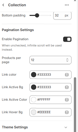
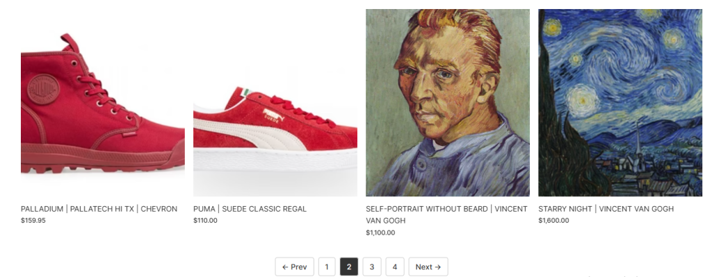
Result