Product pages must serve multiple purposes. Not only does the listing need to entice consumers to buy, but it must make your brand memorable. You have to figure out how to present the product in the best light while still being authentic and honest.
By the year 2040, a whopping 95% of purchases will occur online. E-commerce grows year after year. Now is the time to perfect your strategies and grab some additional traffic from people staying home and avoiding brick-and-mortar establishments.
Some things work for nearly any type of industry. Here are eight design tips to keep in mind when creating a product page.
1. Display Clear Pricing
Have you ever visited a website and couldn’t find information on the cost of the product? You likely bounced away. People won’t take the time to contact you or share their info if they don’t have at least an idea of what the item costs. List the price clearly or explain custom quotes and give users a ballpark figure.
Use a color contrasting with the rest of the page to highlight the price. You may even wish to make the text a little bigger and bolder, creating a hierarchy that shows you understand the importance of cost.
2. Stay Focused
It’s easy to include so much on a product page that the user gets lost in the details. While you want to thoroughly describe the item and offer plenty of pictures, anything not related to selling the product should go. Keep the design minimalist, so the user’s eye goes to the call-to-action (CTA) button. Leave plenty of whitespace for a clean, crisp aesthetic.

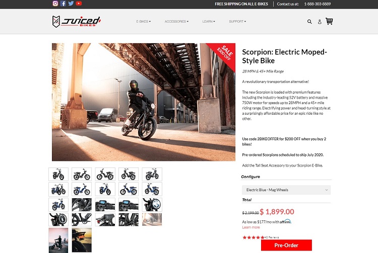
Juiced Bikes uses a beautiful, minimalist design to focus on moving the buyer through the sales funnel. One main image fills the screen with smaller thumbnails to click on. The primary and smaller images keep the page from being cluttered with photos, but still gives the user the information needed to make an informed decision. Note the bright “Pre-Order” CTA button, which contrasts with the white background and grabs attention.
3. Pay Attention to Your Website Color Schemes
Consumers respond differently to various color schemes. Pay attention to the choices on your product pages. While you want a brand color palette, it is okay to mix in other colors from time to time and grab attention. Choosing the perfect color scheme for your brand and individual product pages requires knowing your users and how they’ll react emotionally to your selections.
4. Use Detailed Product Images
How do you create a product detail page? Shopping online presents some unique challenges. The person can’t pick the item up and look at it from all angles or make direct inquiries of a salesperson about options, such as different colors. Your best method of showing users everything they need to know about your products is to offer images from every angle possible.
Add photos of the product from each side, the top and the bottom. Zoom in on details the user might need to know about. A 360-degree video is a nice addition, but even just adding plenty of pictures makes a big difference in a listing.

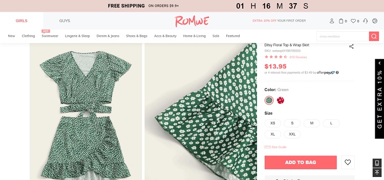
Romwe does a good job of showing their clothing from different angles. You’ll get images of the outfit from the front, back and side. Some of the photographs include models showing how to wear the selection. Click on any image to zoom in for detail or gain access to additional visuals in a clickable slideshow format.
5. Stick to a Style Guide
A style guide ensures all of your pages remain similar in appearance. Creating strong branding helps people identify your store the minute they land there. A style guide simply tells anyone working on your site how to present products, image sizes needed, elements such as bullet points and headings and even the tone the page should take.
Use your style guide anywhere your brand has a presence. If you list your product elsewhere, the look should be as familiar as possible.
6. Show the Product in Action
What makes a great product page? You must show the item in action. How will the consumer use the product? It’s okay to think outside the box a little, but your main images should show the most common uses. For example, if you sell patio furniture, it might work well as a dog agility run, but most will use it for gathering in the back yard with family and friends.

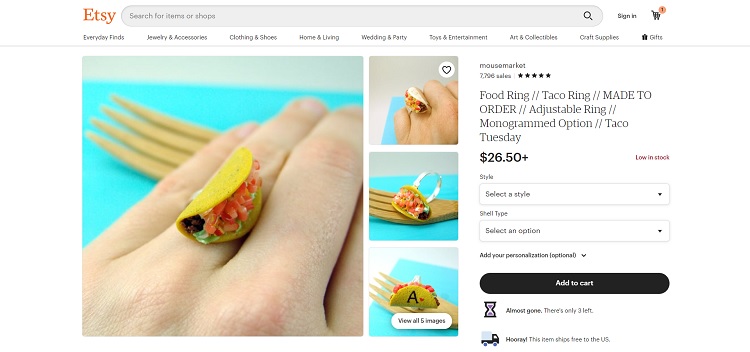
Mouse Market is a genuinely unique Etsy store, offering tiny food products made of mostly clay. Something fun they do with their product descriptions is showing off how people might use the item. Look at the listing above, which is for a taco ring. They could just show the ring, but placing it on a model’s hand highlights the size and how the ring looks worn. They also showcase the items in dollhouses, miniature displays and alongside other figures to show size and function.
7. Write Extensive Descriptions
Users want to know the exact specifications of a product. Start by looking at any questions asked by consumers who’ve visited your site. Their queries are a clue to the things you aren’t answering fully. Next, look at all the details of the product. How big is it? What material is it made from? What colors does it come in?
You should also list some of the benefits of using the product. Try to think through the eyes of your buyer persona. What things would the user most want to know before deciding to make a purchase? Is there a warranty? How long? How are returns or exchanges handled?
8. Revamp Your CTAs
Your CTAs are the thing turning leads into customers. Think through everything from the placement of the button to the language you use to how much white space surrounds your CTA. Conduct some split testing and see which versions of your CTAs work best. Make adjustments as need on each separate product page.
Capture Customers
You can drive all the traffic imaginable to your website, but if you don’t have strong product pages, the visits won’t translate into sales. Think about how to consistently improve your e-commerce store’s design. Meet the needs of users, be aware of new technology such as voice searches and offer the best customer experience possible. With an eye to detail and consistent testing and revamping, your online shop will become a raging success.
Related Articles:

